
Let me tell you something that took me 3 years and a lot of underperforming funnels to learn:
Design is not art. At least not when you're building something that needs to convert.
I started my career as a mechanical engineer. Precise. Systematic. Every part has a function. When I transitioned into funnel design, I brought that engineering mindset with me, but it took a while before I realized that's actually the advantage.
Because in the funnel world, most designers treat pages like portfolio pieces. They optimize for aesthetics. For awards. For screenshots that look good on Dribbble.
Meanwhile, their clients are burning ad spend on pages that look beautiful and convert at 1%.
That's why I developed Conversion Design. Not as a style. As a discipline.
What Is Conversion Design?
Conversion Design is the practice of making every visual decision on a page in service of one outcome: getting the visitor to take the desired action.
It's not about making things ugly. It's about making things intentional.
Every color choice. Every font size. Every amount of white space. Every image placement. These aren't aesthetic preferences. They're conversion levers.
The difference between a "good looking" page and a high-converting page is that the high-converting page was designed with a clear understanding of how human attention works, how trust is built visually, and how friction is created or eliminated through design choices.
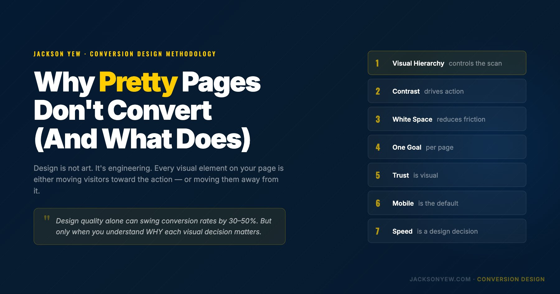
The 7 Principles of Conversion Design
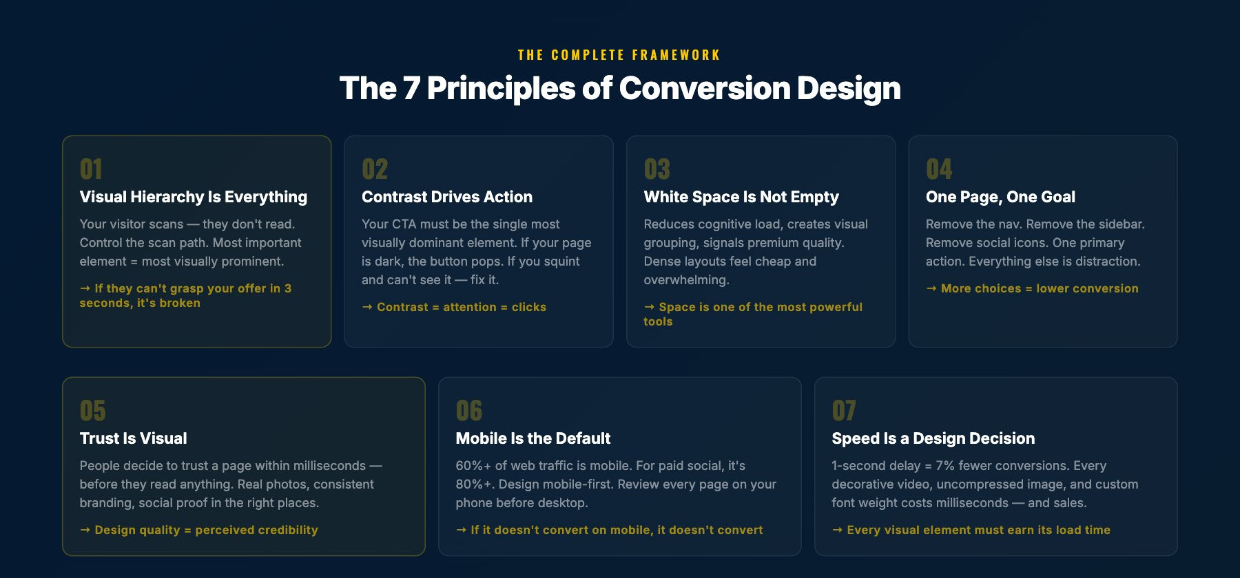
1. Visual Hierarchy Is Everything
Your visitor's eyes follow a predictable pattern. They scan. They don't read every word. Your job as a Conversion Designer is to control that scan.
The most important element on your page should be the most visually prominent. That usually means:
- Largest text = main headline
- Highest contrast element = CTA button
- First thing visible without scrolling = the core value proposition
If a visitor can land on your page, scan it for 3 seconds, and understand (a) what you're offering and (b) what they should do next, your visual hierarchy is working.
If they're confused, lost, or distracted by a decorative element that doesn't serve the conversion goal, your hierarchy is broken.
2. Contrast Drives Action
Your CTA button should be the single most visually dominant element on the page. This is not about making it bigger (though that can help). It's about contrast.
If your page is blue, your button should not be blue. If your page is dark, your button should pop against that darkness. If everything on the page is muted, the button should be the one thing that demands attention.
I've seen pages where the CTA button is the same color as three other elements on the page. The brain doesn't know where to focus. Conversion drops.
Rule: if you squint at the page and the CTA doesn't jump out, fix the contrast.
3. White Space Is Not Empty Space
New designers fill every pixel. Experienced Conversion Designers know that white space is one of the most powerful tools in the toolkit.
White space:
- Reduces cognitive load (less to process = faster decisions)
- Creates visual grouping (related elements feel connected)
- Draws attention to key elements (isolation = importance)
- Makes the page feel premium (density = cheap, space = quality)
When a client tells me "there's too much empty space," I show them the conversion data. Pages with strategic white space consistently outperform cramped layouts. Not by a little. By a lot.
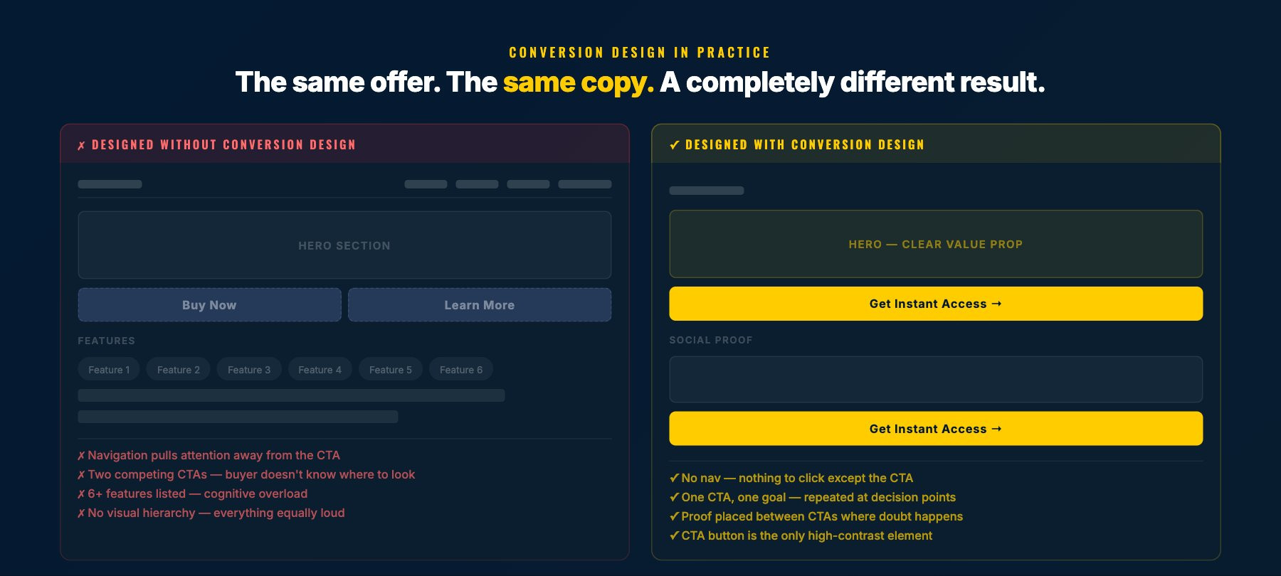
4. One Page, One Goal
Every page should have ONE primary action. Not two. Not three. One.
If your landing page has a "Buy Now" button, a "Learn More" link, a navigation menu, social media icons, and a chatbot widget, you don't have a conversion page. You have a choose-your-own-adventure.
Conversion Design strips everything that doesn't serve the primary goal. Navigation goes away. Sidebar goes away. Footer links go away (or get minimized). Social icons go away.
The page exists for one reason. Everything on the page serves that reason.
5. Trust Is Visual
People decide whether they trust a page within milliseconds. Before they read a single word. That decision is based entirely on visual cues.
Trust signals in Conversion Design:
- Professional photography over stock photos (people can feel the difference)
- Consistent brand elements (colors, fonts, spacing that feel intentional)
- Social proof placement (testimonials, logos, numbers placed where doubt happens)
- Security indicators (SSL badges, payment logos near checkout)
- Real faces (human faces near CTAs increase trust measurably)
I've tested this specifically: the same copy, the same offer, with different visual trust treatments. Design quality alone can swing conversion rates by 30-50%.
6. Mobile Is the Default
Over 60% of web traffic is mobile. For paid social traffic (Facebook, Instagram ads), it's often 80%+.
If you design desktop-first and "make it responsive," you're building for the minority and hoping the majority can deal with it.
Conversion Design is mobile-first:
- Touch targets are thumb-friendly (minimum 48px)
- Text is readable without zooming
- CTA buttons are full-width on mobile
- Forms are minimal (every additional field costs conversions on mobile)
- Page speed is optimized for cellular connections
I review every funnel I build on my phone before I look at it on desktop. If it doesn't convert on mobile, it doesn't convert.
7. Speed Is a Design Decision
A 1-second delay in page load time reduces conversions by 7%. A 3-second delay loses over half your visitors.
Speed is not just a developer problem. It's a design problem.
Every decorative background video, every uncompressed hero image, every custom font weight, every animation. These are design decisions that impact speed, which impacts conversions.
Conversion Design treats load time as a design constraint, not an afterthought. Every visual element earns its place by being worth the milliseconds it costs.
How Conversion Design Connects to Conversion Architecture
Conversion Design is Phase 4 of my broader Conversion Architecture framework. It's the visual execution layer.
But here's the critical thing: Conversion Design only works when Phases 1-3 are strong.
You can have perfect visual hierarchy, perfect contrast, perfect mobile design. But if the headline says the wrong thing (Phase 3), the page is structured in the wrong order (Phase 2), or you're targeting the wrong buyer (Phase 1), the design can't save it.
Conversion Design amplifies a strong foundation. It cannot rescue a weak one.
That's why I always tell funnel builders: learn design, but learn strategy first. The best-designed page with the wrong message will always lose to an average-designed page with the right message.
Common Conversion Design Mistakes
Mistake 1: Designing for the client, not the customer.
Your client's favorite color is purple. Their customer doesn't care. Design for the person buying, not the person paying you.
Mistake 2: Following trends over principles.
Glassmorphism looks cool. Bento grids are trendy. But if they reduce clarity or add cognitive load, they're hurting conversions. Principles beat trends.
Mistake 3: Hiding the CTA.
I've seen pages where you have to scroll 3 screens to find the buy button. Your CTA should appear above the fold AND repeat throughout the page. Make it impossible to miss.
Mistake 4: Using stock photos of people in suits shaking hands.
You know the ones. Your visitor knows they're fake. Use real photos. Real screenshots. Real faces. Authenticity converts.
Mistake 5: Ignoring the data.
Conversion Design is not about what you think looks good. It's about what the data says works. Install heatmaps. Run A/B tests. Let the numbers decide.
Frequently Asked Questions
What's the difference between Conversion Design and regular web design?
Regular web design optimizes for aesthetics, brand consistency, and user experience broadly. Conversion Design optimizes for one metric: getting the visitor to take a specific action. Every design decision is measured against that goal.
Do I need design skills to understand Conversion Design?
Understanding the principles helps even if you're not the one designing. If you're a marketer, copywriter, or business owner, knowing these 7 principles helps you evaluate and improve any page.
What tools do you recommend?
I use Figma for wireframing, GoHighLevel for page building, and Hotjar for post-launch heatmaps. But Conversion Design is tool-agnostic. The principles apply whether you're building in WordPress, Webflow, ClickFunnels, or coding from scratch.
How do I know if my current design is working?
Install a heatmap tool and watch 50 real sessions. You'll see exactly where people are getting confused, where they're dropping off, and what they're ignoring. That tells you more than any design review.
Jackson Yew is a Conversion Design and Funnel Strategist who has built funnels for Frank Kern, Mike Dillard, Dan Lok, and dozens of other 7- and 8-figure businesses. He co-founded Funnel Duo Media in 2018 and holds a Guinness World Record for the Largest AI Marketing Lesson.