Key takeaway
Conversion design is not making a page prettier. It is making the buying decision easier. My rule is simple: fix the message, proof, order, and friction before you argue about visuals. A cleaner design can help, but only after the page gives the right person a clear reason to keep moving.
You lose money when your page makes buying hard. Conversion design fixes that. Contentsquare's 2026 Digital Experience Benchmark analyzed 99 billion sessions across 6,500 plus websites and found conversion rates fell 5.1% year over year. So the job is not prettier pages. The job is clearer buying paths.
Conversion design is the work of making the next step feel plain, safe, and worth it. You use it to fix the message, proof, page order, and friction before you buy more traffic. I used to do this wrong by making pages look sharper before I had mapped the buyer's actual hesitation.
What is conversion design?
Conversion design is the design of the buying decision. It covers the message, proof, page flow, key choice points, and friction that shape whether a visitor moves forward. It is not just visual polish.
The common mistake is simple. Founders treat design as decor after the offer is already hard to understand. They ask for a cleaner hero, better colors, or a slicker section. But the buyer still does not know what the thing does, why it matters now, why to trust it, or what happens next.
That is why conversion design sits between funnel strategy, copy, UX, CRO, and sales psychology. It asks one hard question: what must this person believe before they click?
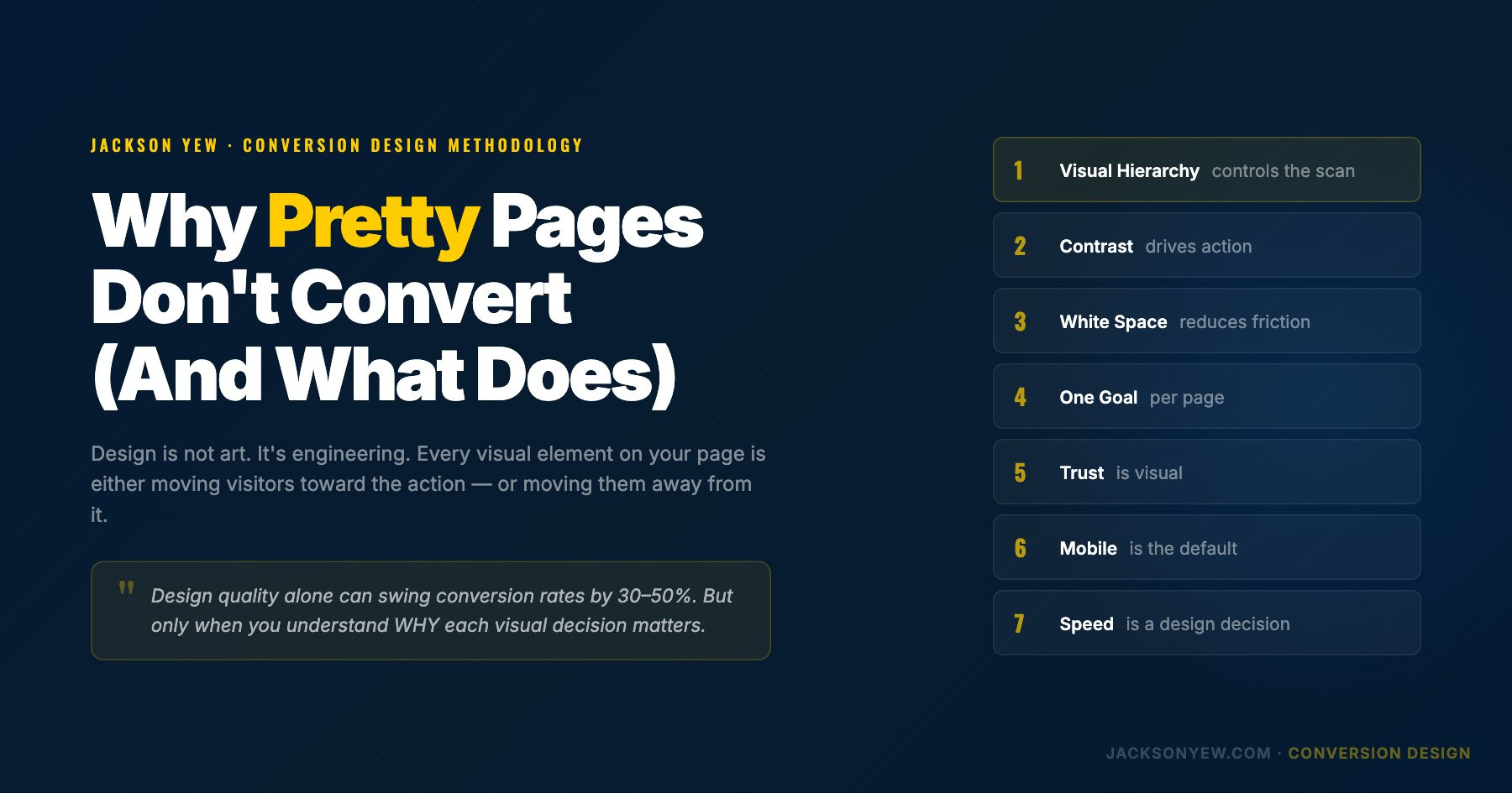
Conversion-centered design principles make that question practical. Every section should reduce confusion, increase trust, or move the visitor closer to a meaningful decision. If a visual choice does none of those things, it is probably decoration.
My rule is simple. Fix the message, proof, order, and friction before you argue about visuals. A cleaner design can help, but only after the page gives the right person a clear reason to keep moving.
Why do most funnels fail before the first test?
Most funnels fail before the first test because the page never earns the click. More traffic does not fix that. If the reader cannot see the offer, the stakes, the proof, and the next step fast, the page leaks.
I have seen teams test button colors when the real issue was that the page never made the buying decision clear. The button was not the bottleneck. The buying argument was.
As of February 2026, Contentsquare reports visits down 3.8%, engagement down 10%, and conversion rates down 5.1% year over year across its benchmark dataset in the 2026 Digital Experience Benchmark. That means weak pages get less room to hide.
Most conversion problems start in four places. The promise is vague. The proof comes too late. The page order fights the buyer's thought process. Or the page asks for effort before it has built enough trust.
This is funnel optimization before it becomes A/B testing. You look for the point where the visitor loses the thread, loses trust, or decides the effort is not worth it. Then you fix the step that is blocking visitor-to-customer conversion.
That is why I would not start with a design refresh. I would start with the buyer's doubt.
How does conversion design work on a landing page?
Conversion design works by turning the page into decision blocks. A strong page does not just stack sections. It moves the buyer through a clear chain.
The blocks are simple. Name the problem. Make the promise. Show the mechanism. Prove it works. Frame the offer. Remove risk. Handle objections. Ask for action.
That is different from attention design. Attention design asks, "What will make them look?" Decision design asks, "What will make them believe enough to act?"
Landing page design matters most when the page has one job. High-converting landing pages are not busy. They make the offer obvious, keep the path narrow, and put proof close to the moment of doubt.
On a landing page, the hero may need the promise and the audience. On a VSL page, the first screen may need the pain and the mechanism. On a lead-gen funnel, the form may need less friction and more reason to share details.
Lead generation pages have their own tradeoff. If the form is too heavy, qualified people leave. If the page gives too little reason to convert, lighter forms only create weaker leads. The job is to balance friction with perceived value.
In one redacted teardown, the main change was not a new visual system. The page had proof under the CTA. Users needed proof before the ask. We moved objection handling and proof above the CTA. The page felt calmer because the order matched the buyer's doubt.
I would design the buying argument first, then make the page look better.
What should founders test before changing the design?
Founders should test buyer doubt before they test taste. Start with the parts that change belief, not the parts that win internal debates.
Test the offer clarity. Can a cold visitor say what you do in five seconds? Test the above-the-fold promise. Does it name the outcome, buyer, and reason to care? Test proof placement. Does trust show up before the ask? Test objection order. Are the scary questions handled before the click? Test form friction. Are you asking for more than the promise has earned? Test CTA intent. Does the button match what the buyer thinks they are doing?
A/B testing works best after this diagnosis. Otherwise you end up testing random variants instead of testing a real hypothesis about why people hesitate. A strong CRO test should say what doubt it is addressing, what behavior should change, and what decision you will make from the result.
A good test backlog should come from hesitation. Use heatmaps, scroll data, session recordings, surveys, sales calls, support questions, and customer testimonials. If buyers keep asking the same thing on calls, the page should answer it earlier. If testimonials keep proving one specific fear wrong, that proof should sit near the claim it supports.
This is also where Search Everywhere Optimization Pyramid for Conversion Design matters. Search visibility only helps if the page can turn that demand into action.
How does AI change conversion design in 2026?
AI changes conversion design by making diagnosis faster. It can mine sales calls for objections. It can compare page patterns. It can draft variants. It can help find gaps between the ad, the page, and the buyer's intent.
But AI cannot replace real proof. It cannot fake trust. It cannot invent a strong offer. It cannot save a page made for every keyword spin with no real buyer insight.
As of February 2026, Contentsquare reports AI-referred traffic at 0.2% of traffic, with lower bounce behavior and conversion performance moving closer to traditional search in its benchmark report. That matters. AI-referred visitors may arrive with more context. They may need faster proof, sharper answers, and less fluff.
I would use GPT-5.5, Sonnet 4.6, or Gemini 3.1 Pro to speed up message mining and page review. I would not let them replace the source material. Feed them calls, reviews, surveys, ad comments, and sales notes.
For AI search, I would also avoid thin query pages. Build one strong page that answers the real set of questions. The Google AI Overviews study shows why source quality and claim fit matter. Spam pages are a weak long-term bet.
What does a strong conversion design review include?
A strong conversion design review scores the page by buyer movement, not by taste. The point is not to pretend one checklist can predict every market. The point is to find the next true bottleneck.
I would review eight layers. First, the market promise. Is the outcome clear? Second, the page narrative. Does each section earn the next one? Third, visual hierarchy. Does the eye go where the decision needs it to go? Fourth, proof density. Is trust close to the claims? Fifth, friction points. Are forms, carts, and checkout steps blocking action? As of 2026, Baymard's cart abandonment research still shows checkout friction as a measurable drag, which makes post-click UX part of conversion design, not cleanup work after the fact, according to Baymard.
Sixth, mobile flow. Does the page still make sense with thumbs and short time? Mobile conversion rate often falls because the page hides proof, compresses comparison, or makes forms and checkout feel heavier than they are on desktop. Seventh, analytics. Where do people stop? Eighth, the next experiment. What would we test first?
For e-commerce conversion optimization, I would add product page optimization and average order value improvement to the review. Product pages need clear images, specific benefits, risk reducers, reviews, delivery clarity, and comparison help. Average order value improves when bundles, cross-sells, thresholds, and add-ons feel useful instead of forced.
A proper conversion audit should end with a ranked list of bottlenecks, not a mood board. The best output is a clear call on what to fix first, what to test next, and what evidence would prove the page is doing a better job.
This is where JacksonYew.com stays as the founder-level thinking surface. Harder service proof, teardown assets, and funnel builds belong closer to The Brand Funnels. If you want the sharper version of this thinking applied to a real offer, learn more.
FAQ
What is conversion design?
Conversion design is the practice of designing a page, funnel, or buying path so the right visitor can understand the offer, trust the proof, answer objections, and take the next step with less friction. It includes copy, page structure, visual hierarchy, proof placement, forms, CTAs, and mobile flow. The common mistake is treating conversion design as decoration. I would start with the buying argument first: what does the visitor need to believe before they act?
Is conversion design the same as CRO?
Conversion design and CRO overlap, but they are not the same thing. CRO usually focuses on measurement, experiments, and improving conversion rates over time. Conversion design happens earlier. It shapes the page so the offer, message, proof, and next action are clear before tests begin. My rule is to use conversion design to build a stronger baseline, then use CRO to test the riskiest assumptions. Testing a weak page only tells you which weak version lost more slowly.
What should I fix first on a low converting landing page?
Fix the buying argument before the cosmetics. Start with the above-the-fold promise, the specificity of the offer, the order of proof, the objections that appear before the CTA, and any form or checkout friction. I have seen teams redesign entire pages when the real problem was one unclear claim near the top. If the visitor cannot answer what this is, why it matters, why you, and what happens next, the visual design is probably not the first bottleneck.
How do I know if a page has a conversion design problem?
Look for hesitation patterns. High bounce, low scroll depth, form starts without completions, rage clicks, repeated pricing-page visits, support questions about basic offer details, and sales calls full of the same objections all point to conversion design problems. The page may be attracting attention but failing to carry the buyer through the decision. I would compare analytics with qualitative evidence, especially sales questions and session recordings, before writing a test plan.
Can AI help with conversion design?
AI can help with conversion design when it is used to speed up research and comparison, not replace judgment. It can summarize sales calls, cluster objections, compare page variants, draft message angles, and identify missing proof. But it cannot invent credibility. A page still needs real customer evidence, specific outcomes, and a coherent offer. I would use AI to get to better hypotheses faster, then validate those hypotheses with behavior, sales feedback, and actual conversion data.
What is a conversion design framework for founders?
A practical founder framework is promise, proof, path, friction, and test. First, make the promise clear. Second, place proof where doubt appears. Third, order the page around the buyer's decision path. Fourth, remove friction from forms, navigation, pricing, checkout, and mobile flow. Fifth, test the highest-risk assumption. Most people build funnels backwards by starting with layout inspiration. I would start with the buyer's hesitation, then design the page around removing it.